
The Wild Oasis - Making It Responsive
why responsiveness matters
after building the custom backend and refactoring both frontends, the wild oasis worked great — on desktop. but try opening it on your phone and things got... ugly. elements overlapping, sidebar taking up the entire screen, tables completely unusable. you know the drill.
so I sat down and made both the admin dashboard and the customer website fully responsive. the interesting part? they use completely different CSS approaches — styled-components on the admin side and tailwind on the customer side. same goal, two different playbooks.
the customer website (tailwind CSS)
the customer-facing site is built with next.js and tailwind, so responsiveness here is all about mobile-first utility classes — sm:, md: prefixes that progressively enhance the layout as the screen gets bigger.
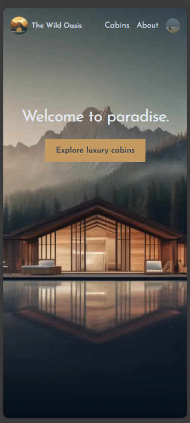
home page hero
the hero section needed to scale its typography and CTA button properly. the heading goes from text-4xl on mobile to text-8xl on desktop, and the button padding scales with sm: breakpoints.
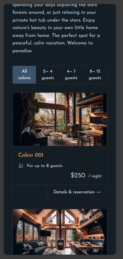
cabin cards
the cabin cards were originally side-by-side (flex-row). on mobile they now stack vertically (flex-col sm:flex-row) with the image using aspect-video to maintain a clean ratio. the detail page also collapses to a single column.
about page
the about page used a 5-column grid for its content layout. on mobile this collapses to a single column (grid-cols-1 md:grid-cols-5), with all col-span-* classes prefixed with md:. headings scale down to text-3xl and gaps are reduced.
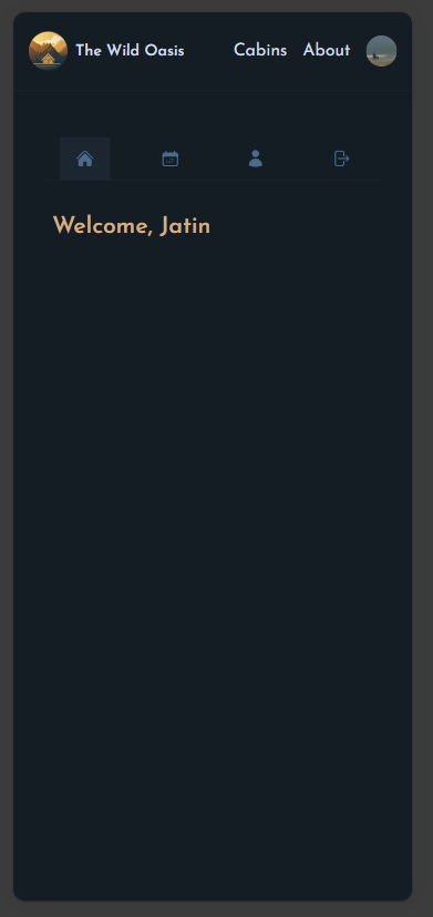
account section — sidebar to tab bar
this was one of my favourite changes. the account sidebar with text links transforms into a horizontal icon-only tab bar on mobile. the text labels get hidden md:inline, and the nav switches to justify-around with the border moving from the right side to the bottom.
the sign out button follows the same pattern — icon only on mobile.
reservation layout
the calendar + reservation form grid changes from grid-cols-2 to grid-cols-1 md:grid-cols-2 — calendar stacks on top, form below. reservation cards also stack vertically and hide some date details on mobile.
live site: the-wild-oasis-client-jatin.netlify.app
the admin dashboard (styled-components)
the admin dashboard is a react + vite app using styled-components — so responsiveness here means writing @media queries inside template literals. different vibe, same results.
sidebar → hamburger menu
the biggest structural change. on desktop, the sidebar is always visible in a two-column grid. on mobile, it becomes a fixed-position overlay that slides in from the left when you tap the ☰ button.
I created a new SidebarContext to manage the toggle state, and added a backdrop overlay when the sidebar is open.
Desktop: [Sidebar | Main Content]  — sidebar always visible in grid
Mobile:  [Main Content] + overlay sidebar triggered by ☰ button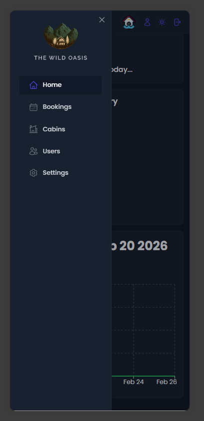
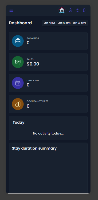
dashboard grid
the dashboard stats grid goes from 4 columns → 2 columns at 1024px → 1 column at 768px. the tricky part was the chart components — they had hard-coded grid spans like grid-column: 3 / span 2 which reference columns that don't exist in a 1-column layout. all charts reset to 1 / -1 (full width) on mobile.
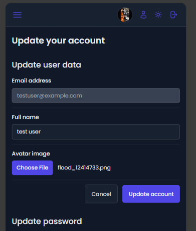
forms & header
modal forms switch from a 3-column grid layout to a single column on mobile, and the modal itself goes to 95vw width. the header hides the username text and only shows the avatar circle, with the hamburger using margin-right: auto to keep the icons right-aligned.
tables
rather than hiding columns or redesigning tables for mobile, I went with a practical approach: a min-width: 60rem on the table ensures it maintains its readable layout and scrolls horizontally inside an overflow-x: auto container.
live site: adorable-gecko-dced13.netlify.app
patterns that worked
| Pattern | Where Used |
|---|---|
| Hamburger sidebar | Admin — collapsible overlay |
| Icon-only nav | Customer — account tab bar |
| Grid collapse | Both — grid-cols-1 on mobile |
| Flex-wrap | Admin — Row, TableOperations, Filter |
| Min-width + scroll | Admin — Table component |
| Hidden text | Both — UserAvatar, SideNavigation |
| Font scaling | Both — headings and buttons reduced |
bug fixes along the way
responsiveness work has this funny side effect — you end up finding bugs you never noticed on desktop.
isLoading1undefined in DashboardLayout — missing destructuring alias&mdashmissing semicolon in BookingRow — rendered as literal text instead of an em dash- CORS blocking preflight —
cors()middleware was afterhelmet(), had to move it first - rate limit too aggressive — 100 requests/hour was choking development, bumped to 1000 in dev mode
conclusion
making two apps responsive with two different CSS approaches was a great exercise. styled-components gives you full control but you write more code. tailwind is faster but you need to think mobile-first from the start.
the key takeaway: don't fight the grid. if your desktop layout uses a 4-column grid, plan early for how it collapses. retroactively fixing grid spans that reference non-existent columns is not fun.
- Source: GitHub Repository
- Customer Site: the-wild-oasis-client-jatin.netlify.app
- Admin Panel: adorable-gecko-dced13.netlify.app
Comments